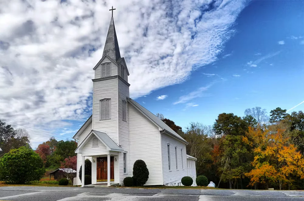
A lot of careful consideration should go into the process of painting your house of worship.The painting services themselves need to be respectful, considerate of the environment, and of course flexible - easily adapting to your schedule.
The colors are equally important. Different tones and shades impact us in different ways, some creating a feeling of energy and motion, and others evoking relaxation and calm.
Here are a few tips to keep in mind.
Planning the Perfect Palette for Your Religious Center
Our first interior painting tip?
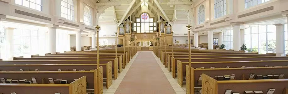
Consider your fixed colors, and architectural elements. You may love a certain paint color, but if it doesn’t work alongside your stained glass, stone, brick, or woodwork, it isn’t the right candidate. Think of these existing features not as barriers, but as opportunities for inspiration. Your perfect palette will complement and accentuate them, not clash.
How much natural light do you have? If it’s minimal, you may want to choose a lighter wall and ceiling color to help maximize the light you do have.
Your room’s shape should also direct your color selection. Darker accent colors are better saved for shorter walls, while longer walls can appear even longer with light colors. Creatively picking your paint will help create the illusion of space and height.
Consider Color Psychology
As we mentioned above, color can have a serious impact on mood and energy.
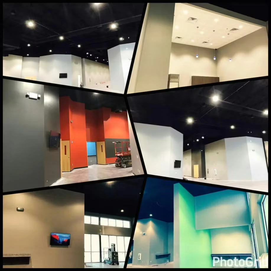
That’s why brighter, more vibrant colors can be the right pick for kids’ spaces, or for common areas where people gather. A more subdued palette, on the other hand, might be better for worship spaces and meeting rooms.
The most energetic colors are red, orange, and yellow, while more natural, earthy colors are more calming. Blue, green, and grey, for example, all promote relaxation and focus.
How Can You Play It Safe?
If you’d like something timeless and simple, you really can’t go wrong with a warm neutral. Your painting company can help you pick one, based on their recommendation for a specific manufacturer.
Have any other church painting questions? The Painters USA team is here to help. Contact us today!